Visualizing Texas Medicaid Healthcare Quality Trends
A recap of data visualization techniques applied in the 2024 Texas Quality Forum project. This post showcases how Python was leveraged to create compelling visual insights into trends in Potentially Preventable Events.

Five-Year Trends by Service Area for PPA
Figure 1 above is a multi-panel plot showcasing trends in Potentially Preventable Admissions (PPA) from 2018 to 2022 for Texas Medicaid. PPA is one of the key potentially preventable event metrics developed by 3M; a lower PPA rate reflects better management of chronic conditions and the prevention of severe illnesses.
Each panel focuses on a specific service area, with the primary line for that area displayed prominently, while other service area lines are shown in lighter colors for easy comparison. This allows readers to see how a selected service area compares to the overall state trends. Each dot on a line represents one year, and the panels are sorted by 2022 PPA rates, from lowest to highest.
Key Insights:
- Overall, most service areas show a downward trend, indicating improved preventive care over time.
- Jefferson recorded the lowest PPA rate in 2022, reflecting strong preventive care efforts.
- Dallas experienced an increase in PPA rates after 2020, signaling potential challenges in maintaining access or quality.
- El Paso and Bexar consistently reported higher PPA rates, highlighting areas where targeted improvements could have a significant impact.
Exploring PPA, PPV, and PPR Relationships: A Bubble Plot Analysis
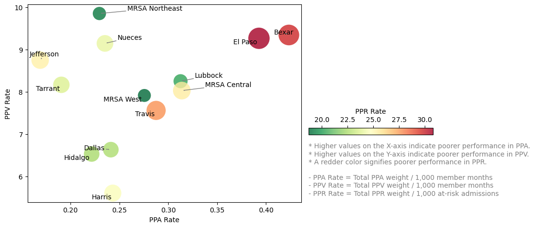 Figure 2. Relationship of PPA, PPV, and PPR across service areas in Texas.
Figure 2 visualizes the relationship between three potentially preventable event metrics—PPA, PPV, and PPR—for Texas Medicaid service areas in 2022. Each metric highlights a unique aspect of preventable events in healthcare:
- PPA (Potentially Preventable Admissions): Reflects gaps in managing chronic conditions or preventing severe illnesses.
- PPV (Potentially Preventable Visits): Measures the effectiveness of primary care access and outpatient management.
- PPR (Potentially Preventable Readmissions): Evaluates the quality of care transitions and post-discharge support.
Since differences in bubble size can be challenging to distinguish, bubble color was added to enhance clarity. Higher values across these metrics indicate poorer outcomes, with redder bubbles signifying higher PPR rates.
Key Insights:
- Service areas with larger, redder bubbles near the top-right boundary, such as El Paso and Bexar, warrant further investigation due to high PPA, PPV, and PPR rates.
- MRSA Northeast performed well in PPR and PPA but had the highest PPV, suggesting targeted opportunities for improvement in outpatient care.
- Dallas, Hidalgo, and Harris showed lower rates across all three metrics, indicating strong overall performance.